
Zeplin
homepage update
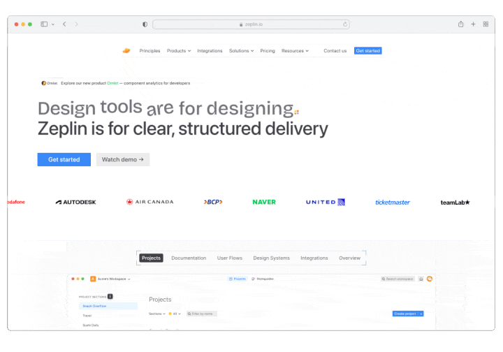
This project focused on updating the Zeplin homepage and underlying design system to better reflect the product today. The goal was to create a more inviting hero section that encouraged exploration through an interactive snapshot of the product.
I led the project end-to-end, including visual and interaction design, animating the homepage header, updating the design system, and refreshing all visual assets.
Role
Visual Design
Animation
Project Management
Team
Pelin Kenez, CEO & Creative Director
Salih Berk, Designer & Prototyper
Timeline
10/1/2025 - 10/31/2025

Challenge
The Zeplin homepage relied heavily on copy and static images to explain everything the product could do. While the information was thorough, it was difficult for users to retain — especially without seeing the product in action.
The challenge was to reduce this cognitive load by shifting from explanation to demonstration. We introduced an interactive product snapshot directly after the hero, allowing users to explore the UI and click into key areas. Contextual info pop-ups provide quick explanations of what each feature does, helping users understand the product through interaction rather than long-form copy.
Secondary challenge
By 2025, the Zeplin website had drifted into a patchwork of inconsistent typography, spacing, button styles, and core primitives. Over time, incremental updates were made to the design system without being fully applied across the site, leaving different landing pages visually and structurally out of sync.
These inconsistencies made the site harder to maintain and scale, and more importantly, created friction for users by presenting an unclear and unreliable brand experience. To move forward, the design system needed to be updated and the landing pages redesigned to bring everything back into alignment.
Typography updateColor updateSpacing updateDesign
As a result of the design systems update, I was able to standardize our homepage, integration page, pricing page, and principles page with updated colors, spacing, and typography.
HomepageIntegration pagePricing pagePrinciples page