Tencent Cloud rebrand
Tencent Cloud International is a cloud computing service operated by Tencent. Tencent is now the largest Internet company in China and Asia. It provides services to hundreds of millions of people via its flagship products like QQ and WeChat.
Role
Art Direction
Brand Identity
3D Illustration
2D Illustration
Team
Anderson Lin, Marketing Director
Katie Lu, Product Marketing Manager
Timeline
2018 - 2021
Challenge
While Tencent Cloud sits within a well-established global organization, it lacked a distinct brand identity of its own. The challenge was to define an identity that felt clearly connected to Tencent, while also giving the cloud business room to express its evolving vision and long-term ambitions as a fast-growing, startup-like team.
Colors
The primary palette builds on Tencent’s existing blue and white, reinforcing a connection between parent and child brands. These colors form a calm, neutral foundation that works across both digital and physical media.
An accent orange was introduced to create contrast and visual hierarchy within a predominantly blue color scheme. Used sparingly, it draws attention to key elements such as calls to action and important UI elements.
Website redesign
Tencent Cloud International’s homepage felt outdated and flat. Using our new colors and style guide we were able to revamp the site. Please reach out for more details.
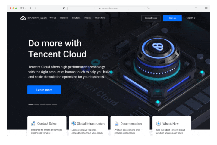
New homepageOld homepageMarketing assets
In addition to establishing a visual direction, the brand needed to scale across a wide range of assets. This included creating a cohesive system of colors, iconography, and tone of voice, as well as designing evergreen assets that could be reused across conferences and events. From pamphlets and postcards to business cards, booth designs, and large-scale conference banners, the identity needed to remain flexible, recognizable, and consistent in both digital and physical spaces.
The new brand identity of Tencent Cloud shown in Times Square.3D assets
In 2020, Tencent Cloud China shifted the brand design from isometric to 3D. I quickly had to redesign all of our assets to have a consistent style with our HQ.